Design trends realised: A big year for big typography
31 May 2022 / Opinions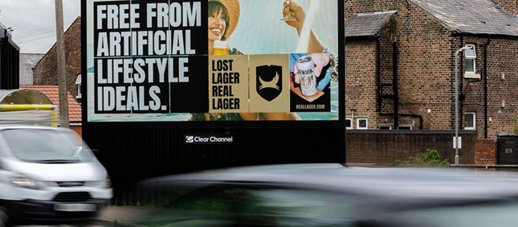
Back in those ‘design trends for next year’ articles, one of the common themes that was highlighted for this year was that of the return of big type. And a few months in, it’s a trend that is being realised, and one that I think is perfect for brands to lean into to make effective use of their Out of Home advertising.
Let me explain.
As part of the Powerful Posters series, we discuss copy legibility a lot.
But key to designing for Out of Home, is understanding the channel, the formats (benefits, capabilities and limitations) and crucially the real-world context in which your creative will be displayed, and consumed. Out of Home is a largely passively observed channel.
“What you have to remember is that most of the people that engage with our brands do so with a glance here and a look there. Especially with out of home, it’s not just one seconds, it’s a number of one seconds. That builds familiarity.”
- Mike Follett, Managing Director, Lumen Research
So when thinking about this expert advice, from an expert in attention, the challenge for creatives and designers is how to get across a concept in the simplest way. According to one of our creative panelists, boiling an idea and your message down until it’s as pure as it can be is the whole game.
“I think that’s the exercise, you’ve got to boil it down, until it’s a new truth, it’s a new conviction, in a way you’ve not heard before... It’s a really healthy creative exercise, as a company or as a brand, to imagine things in the quickest, sharpest, most focussed place. You know, if you can draw it on a post-it, in some words or whatever, or you can find one image... I think if you can crystalise your thoughts in that way it’s only going to be healthy no matter where it ends up...”
- Nils Leonard, Co-founder, Uncommon Creative Studio
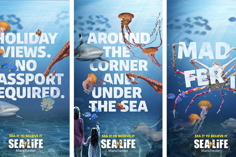
Once you have that idea, and that perfect copy, it’s then about giving it the best chance to be read, in those multiple exposures and seconds that people spend with our brands.
We provide a simple framework to make the most of the space on Out of Home, given how users will interact and engage with our formats.
Keeping it simple, succinct, striking and sensible.
Over the past month, I’ve seen a noticeable shift in brands making full use of the poster and fully embracing and maximising the size of their copy within their ads.
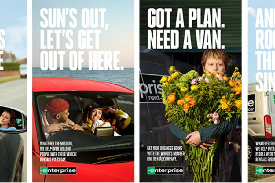
This Enterprise series, with a simple headline and striking imagery caught my eye cross-track on the tube, also running on Adshel Live, dreaming of my mam’s best Yorkshire’s. It's a perfect example of making full use of the negative space, imagery that is captured for the format and pushing the typography that extra 10% to make best use of the medium.
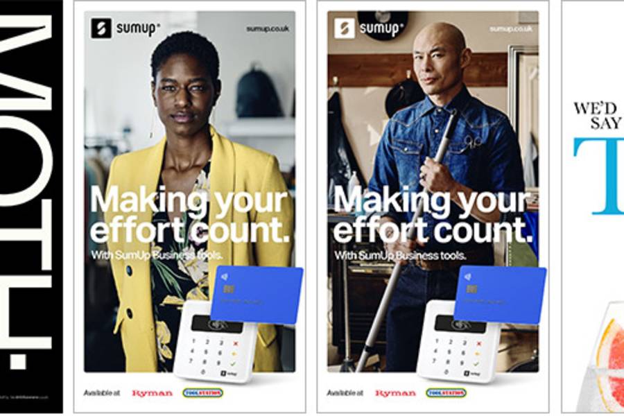
Another few notable examples from various categories including Fevertree, MOTH and SumUp all embracing big type. I particularly like the use of diversity within the ad creatives for SumUp, with the business owners being more representative.
For more info on understanding Out of Home, best practice on designing more effective posters, or the latest insight on the channel, Get in Touch.
BONUS
We’ve just released our new animation, wrapping up the best advice from our creative roundtable. Take a peak:
by Ben Hope, Marketing Director
SHARE POST
PRESS ENQUIRIES


