You’ve got your creative idea. You’ve got your media plan. You’ve made the right call, Out of Home is on there. Now you need the assets. Just how do you design the best Out of Home ad?
A lot of the advice in this section feels obvious. However it’s requested from us time and again by brands, creatives and designers alike, who don’t frequently design for the Out of Home space.
Our primary advice is to understand what each element of your OOH plan is set out to do, and steadfastly stay true to hitting that objective. Objectives will obviously differ for a huge variety of reasons, including brand or product awareness, consideration, health and lifecycle stage.
The other is to look at poster designs how they’re consumed, not on a computer screen. We have the perfect space, the Bauer Media Outdoor Playground to view your ads in the flesh, or a range of free online resources to view them in situ.
Legibility
We’ve created a simple framework that will help designers craft and create Powerful Posters.
Simple. Striking. Succinct. Sensible.

Simple
Simple poster designs are more effective. Obvious?
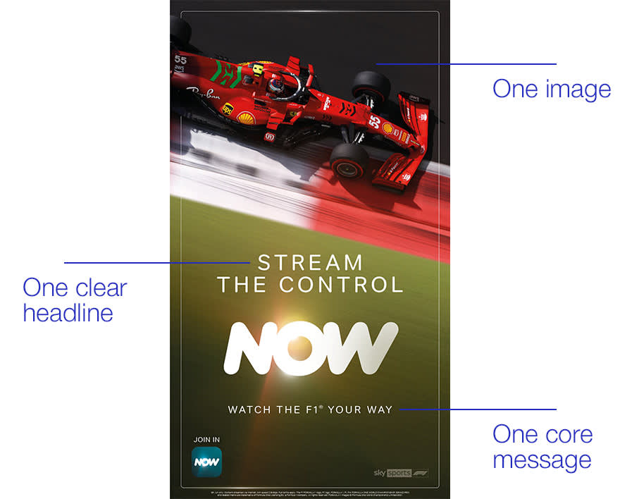
One clear headline, image and core message should form the foundation of your ad and hit your objectives. According to Talon’s Creative Canvas insight study, simpler designs drive a higher attention fixation that those that are overly cluttered, where a viewer is made to work too hard to take away your message and call-to-action.

With the flexibility of DOOH, there is also the opportunity to keep messages fresh and deliver against one core message per creative as part of a multi-creative Out of Home campaign. Insight from QMS, Go Digital and Go Unique, shows evolving DOOH creatives as part of your campaign increases memory encoding.
38
higher impact when using changing or evolving digital OOH creative
Source: QMS Australia
Finally, keeping things simple doesn’t mean clean, boring or minimalist – which leads us on to...

Striking
Great Out of Home ads draw attention.
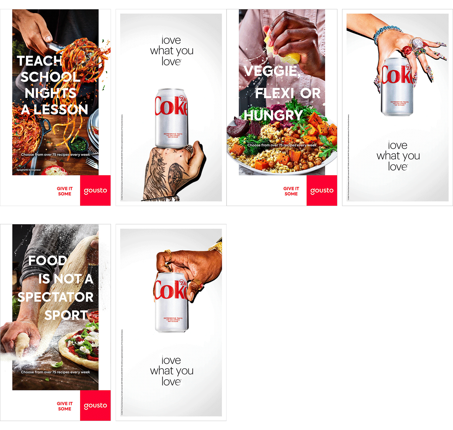
Beautiful imagery, whether high quality product shots or well captured lifestyle photography, with plenty of negative space for the easy inclusion of copy and branding are essential for crafting Out of Home ads.
To get your message across quickly, particularly on roadside formats consumed at speed and/or distance, typography with high contrast and larger copy size delivers the best opportunity for people to understand and process your message. Make full use of the canvas, declutter and lean into your brand and campaign visuals.
Alongside contrast, bold and bright colours also work well on Out of Home.
Succinct
Closely tied to keeping things simple, is to keep your message succinct.
Across several industry studies, shorter succinct copy is seen to drive better comprehension and memorability. Posterscope’s Creative Elements for Effective Campaigns study highlights that optimising copy length and logo size are the biggest creative drivers for increasing brand effects and recall, and a study from KantarMillwardBrown showcased more succinct comms delivered greater impact on recall and understanding.
Source: Powerful Posters and Gorilla in the Room, 2022
2.4
uplift in message recall

Sensible
The composition of your poster should make it easy to be scanned, processed and understood.
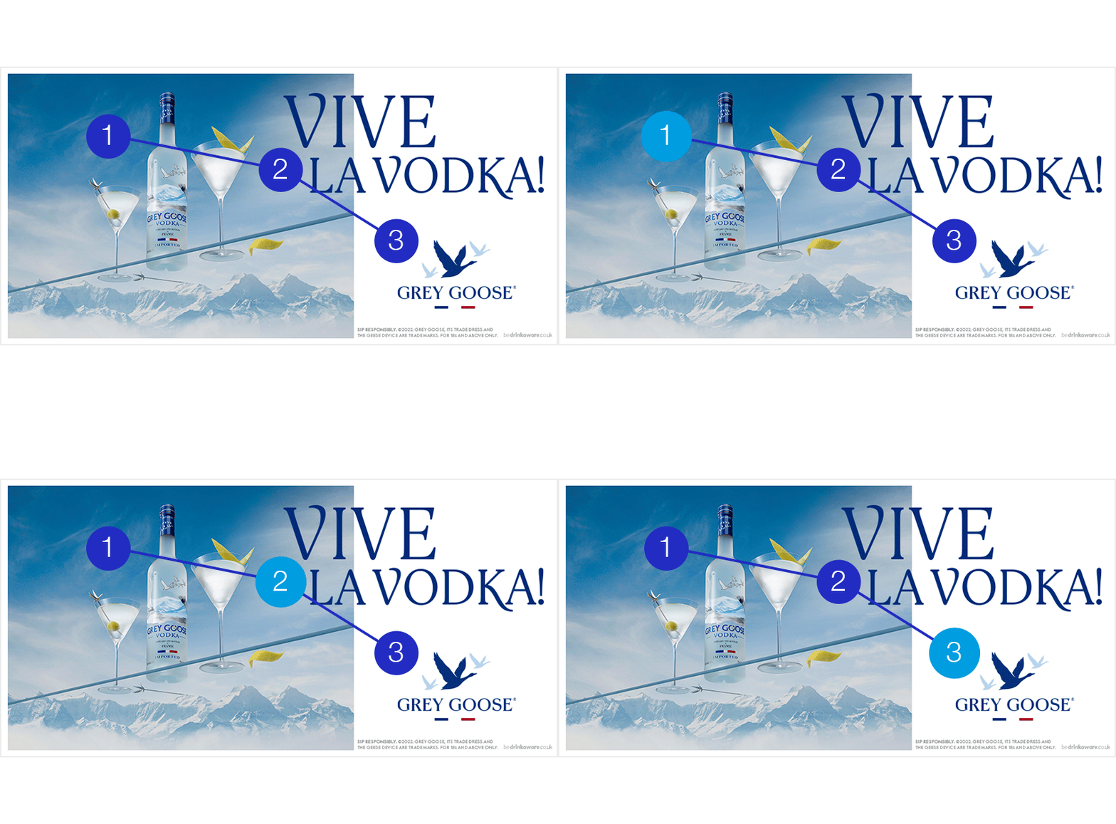
Creatives are read left to right, top to bottom. Each element of your poster should add, rather than detract, from your focussed objective and the composition and a sensible, uncluttered layout will create an easy flow for the eye to help people to take away your message.
For younger brands, or those wanting to build brand health, insight shows that increasing the size of your logo for association is a sensible way to achieve this. Attract (1) with a key image, communicate (2) your message with a clear headline, and associate (3) with your brand well incorporated into the ad. Making your brand more prominent at the start of the flow will also help recognition.

Building on from striking and succinct, a key part of making a legible, effective poster is ensuring your copy is large enough to read. And is it large enough to be understood? On a roadside poster from a car?
Finally, our industry talks a lot about customer experience, and that should translate to OOH. When including call-to-actions, or using QR codes on posters, make sure this is accessible and easy for people to use and access.


